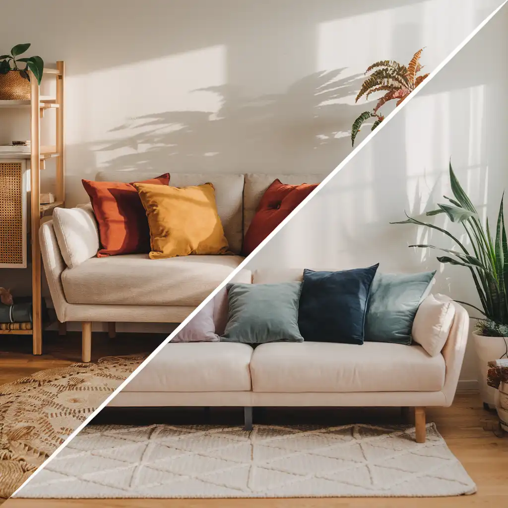
You think picking a cushion is all about comfort? Let’s talk color for a minute.
Cushions are silent messengers of mood. Their color alone sets the tone: energizing, soothing, sunny, arty, or cocoon-like.
So, what vibe are you aiming for?
You don’t need a degree in color theory — just a few simple tips to create the perfect combo for your space… all with a few well-chosen cushions.
🎨 Analogous or complementary colors: let’s keep it simple
In basic color theory, two main strategies help create harmony:
- Analogous colors (aka neighboring shades):
they sit side by side on the color wheel (think blue + green, orange + red).
Great for a soft, fluid, natural look. Perfect for a gentle and inviting vibe. - Complementary colors:
opposites on the color wheel (like blue/orange, yellow/purple).
Great for a bold, dynamic feel — sometimes dramatic, always eye-catching.
💡 Pro tip:
If you’re using mostly similar tones, add one contrasting cushion (or a frame, or a plant) to wake things up without throwing off the balance.
🧠 The psychological effect of colors: your space is (mentally) influenced
Each color creates an emotional response, an inner rhythm.
Here are a few common color associations:
- 🔵 Blue: calm, coolness, space.
A go-to color for relaxation. - 🟢 Green: balance, peace.
The link between nature and calmness. - 🟡 Yellow: joy, energy, light.
Perfect for boosting a tired space. - 🔴 Red: passion, warmth, vitality.
Adds intensity to any room. - 🟣 Purple: creativity, mystery, elegance.
Ideal in deeper, richer tones. - 🟤 Terracotta, ochre, and the like:
warmth, rustic chic, grounded coziness. - ⚪ Beige, linen, sand:
softness, neutrality, elegance. The stars of natural style. - ⚫ Black (or very dark):
depth, structure, boldness.
Use sparingly to anchor your space.
🎯 Bottom line:
When choosing a cushion, ask yourself how you want to feel in the room.

🧵 And what about patterns?
Colors are key — but so are patterns.
A blue cushion with leafy motifs won’t feel the same as a plain blue one.
Patterns tell stories. They shape style and mood.
🎶 Printed patterns are like lyrics — they give your space a voice.
- Soft, flowing shapes (leaves, waves, curves) = calming effect.
- Geometric or contrasting patterns = rhythm, energy, bold character.
- Illustrations or iconic designs tell a story — and can express style, culture, or even humor (think Nordic, vintage, playful…).
🧡 A cushion isn’t just decorative — it speaks.for you.
Let it set the tone.
🧩 Color combos that match your vibe
- For a cozy zen cocoon: soft tones like sage green, beige, pearl, off-white.
Avoid bold contrasts. Choose linen or cotton textures. - For a warm and vibrant vibe: terracotta, mustard, rust, copper brown + a pop of red.
Add patterns or textured fabrics for a bolder effect. - For a strong, confident look:
yellow + emerald, rose + black, or mix patterns and shapes.
High contrast, bold designs, striking impact. - For a minimalist look: keep it neutral — off-whites, muted tones, simple shapes.
Fabrics matter here: go for texture or luxury.
🎯 The 60-30-10 rule (don’t worry, it’s easy):
A simple formula to balance your look:
- 60 % = main color (e.g. walls, sofa)
- 30 % = secondary color (e.g. curtains, rug, a few cushions)
- 10 % = your accent pop (e.g. one bold cushion, wall art, or lamp)
🛑 Tip:
This ratio works even if your sofa is neutral — the pop can come from accessories!
💬 In short: let your cushions speak
Your cushions are more than accessories — they’re mood setters, emotional messengers, and sometimes visual showstoppers.
So, what story are you telling today?
Whether you’re cheerful, bold, inspired, or serene — at QueDesCoussins, we love helping you express that through color.
(We might have a soft spot for warm hues… but shhh.)
🙋♀️ Mini FAQ – Color & Style: All You Need to Know
➡️ Can I really put warm cushions on a beige sofa?
👉 Yes! Try warm tones (terracotta, mustard, olive green) for contrast — or even bold accents like navy or black to elevate the look.
➡️ How many cushions on a couch?
👉 For a 3-seater: 3 to 5 cushions.
Mix sizes, textures, and patterns.
Odd numbers = better balance.
➡️ Should all the cushions match the sofa?
👉 Not at all!
Contrast and layering add depth and personality.
➡️ Which colors should I avoid in a kid’s room?
❌ Avoid intense red or orange — too stimulating.
Go for calming tones like soft blue, green, or lavender.
In play areas, use vibrant colors in small touches only.
